Cooking is a serious and competitive business and professional cooking schools can have the air of military camps where fear and strict order dominate. Nothing wrong with that in the world of celebrity chefs, fame and Michelin stars.
But for the rest of us, cooking is either a fun and enjoyable creative endeavour or a boring daily necessity best avoided at all costs.
Many consumer-facing cooking schools, sensing a growing market niche, are offering relaxed, fun classes in cool surroundings that don’t intimidate the participants.
The all-female Japanese ABC Cooking Studio has more than 125 casual cooking studios in Japan, Hong Kong and China.
High-stakes chefs train elsewhere, but ordinary women who love sophisticated cooking in a happy, relaxed atmosphere flock to ABC whose studios draw more than 250,000 participants per year.
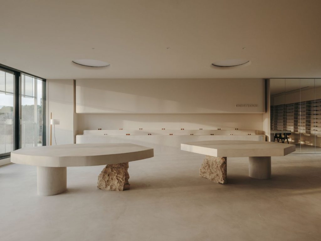
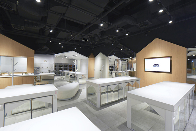
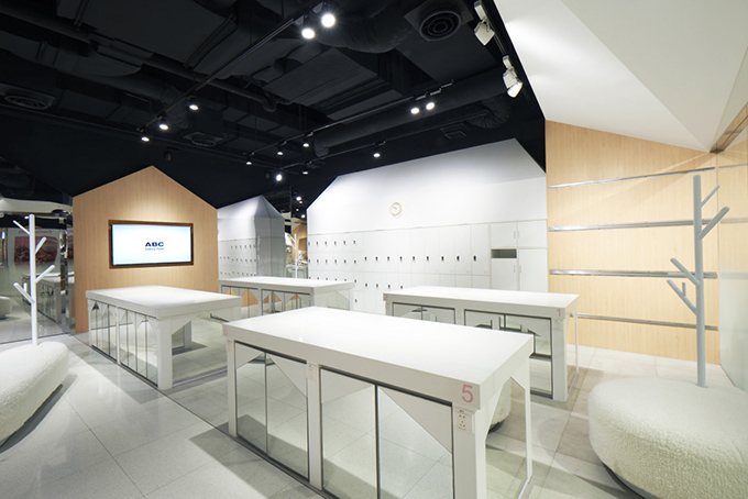
Their latest location, in Huangpu, Shanghai, China, is a new take on their already relaxed approach to cooking. Designed by Prism Design under the direction of Reiji Kobayashi, the new studio is all white, soft and friendly.
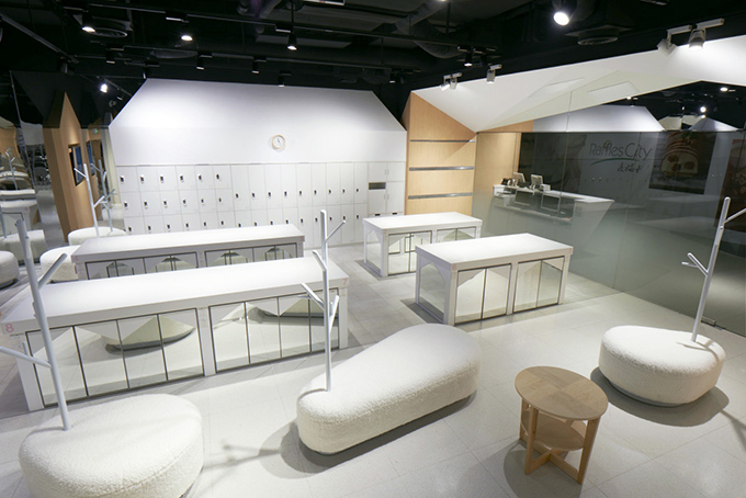
Black ceilings, light wood accents and white main features keep the studio’s ambiance clean and professional, avoiding the all-so-common trap of too cute that would have opened up with the introduction of pink, baby blue or yellow.
You can relax now and forget all of your bad memories (should you have any…) of drab and dreary home economics classes because the newest cooking schools are cool.
It is true that The Culinary Art School in Tijuana, Mexico is not of the high-school variety – it is for serious chefs with high aspirations – but it oozes a new, cool confidence that could potentially turn even the most nonchalant teenager into a passionate chef.
The elegant use of wood is the key attribute in The Culinary Art School. Its new building was designed by San Diego, California-based Jorge Gracia Arquitecto whose founder, Jorge Gracia, was born in Tijuana in 1973.
The entire school complex carries an air of strict order, almost an ascetic solemnity. If you didn’t notice the stoves or wine racks, you could mistake this for a place of religious study.
And, passionate chefs certainly express a fervour for food, ingredients and cooking that could be likened to religious zeal. It is easy to imagine how the colours, textures and aromas of various ingredients stand out in this kind of environment. It is like a stage for culinary creation or like a frame for gastronomic artwork.
Also in the category of cool cooking schools is the Sydney Seafood School established in 1989 and completely refurbished for its 20th anniversary. It conducts cooking classes for all skill levels and draws more than 12,000 students annually.
Words such as handsome and sexy come to mind when you look at this space, the creative work of Dreamtime Australia Design, based in Sydney, Australia.
Some time ago, we have featured Dreamtime-designed Churchill Butcher Shop in Sydney.
In Sydney Seafood School, a tactile intrigue, and a contrast between serious study and serious fun, are evident in every space. The school’s entry wall is a honeycombed sandstone creation by sculptor Michael Purdy.
The dark and impressive hands-on kitchen looks formidable with lots of shiny stainless steel and glass, but its gravity is lightened by chalkboard walls with ‘fish graffiti’ as art. The cool auditorium’s walls are lined with Icelandic fish leather. In the dining room, the harbour view competes for attention with a row of fun fishnet chandeliers and their more than 6,000 little globes. Where do we sign up? Tuija Seipell